
Table of Contents
ToggleBy the end, you should be able to:
- Interpret scatter diagrams and correlation coefficients in plain nursing language.
- Explain simple linear regression using a real nursing or public health example.
- Interpret a basic regression table (coefficient, confidence interval, p-value) confidently.
- Integrate key ideas from epidemiology and biostatistics into a coherent decision framework.
- Prepare confidently for continuous assessment and the final examination.
"How do we use data to describe relationships, make simple predictions, and support public health decisions?"
As a nurse or public health officer, you rarely look at just one number in isolation. You need to know whether two things move together. If they do, you can plan better, predict needs, and target interventions.
| Health Situation | Variable X | Variable Y |
|---|---|---|
| Nursing workload | Number of patients seen per day | Average waiting time in OPD |
| Maternal care | Number of ANC visits attended | Likelihood of facility delivery |
| Child nutrition | Child age in months | Weight-for-age z-score |
| Malaria seasonality | Monthly rainfall (mm) | Number of malaria cases |
| Immunization coverage | Distance from village to clinic (km) | Measles vaccination rate (%) |
Correlation helps you answer: "Do these two variables move together?" It does NOT tell you "Does X cause Y?" That requires a different level of evidence.
A scatter diagram (or scatter plot) is a picture of paired values for two numeric variables. Each dot on the graph represents one observation — one patient, one day, one village.
How to set up a scatter diagram:
- X-axis (horizontal): The explanatory variable — the one you think might explain or predict the outcome. Also called the independent variable or predictor.
- Y-axis (vertical): The outcome variable — the one you want to explain or predict. Also called the dependent variable or response variable.
- Each dot: Represents one pair of measurements (one X value and one Y value).
A simple rule: "X explains, Y is the outcome." If you are predicting waiting time FROM patient load, then patient load goes on X and waiting time goes on Y. Mnemonic: "Xplains Your outcome" — X explains Y.
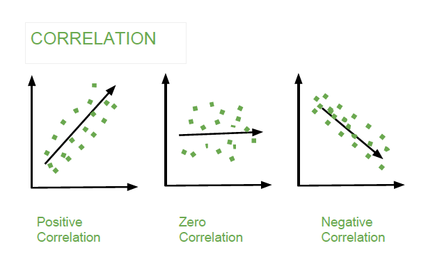
The first question when looking at a scatter plot is: Which way does the cloud of points move?
| Direction | What It Looks Like | Nursing Example |
|---|---|---|
| Positive (↑↑) | As X increases, Y also increases. Dots rise from left to right. | More patients → longer waiting time. More ANC visits → higher birth weight. |
| Negative (↓↑) | As X increases, Y decreases. Dots fall from left to right. | Greater distance to clinic → lower vaccination coverage. More health education → fewer teenage pregnancies. |
| None (random) | No clear pattern. Dots scattered all over. | Shoe size and blood pressure — no logical connection, so no correlation. |
The second question is: How tightly do the points follow a pattern?
| Strength | Visual Pattern | What It Means |
|---|---|---|
| Strong | Points cluster very tightly around an imaginary straight line. | X is a very good predictor of Y. You can predict Y quite accurately from X. |
| Moderate | Points follow a general trend but with some spread. | X predicts Y reasonably well, but other factors also matter. |
| Weak | Points are widely scattered; the trend is barely visible. | X is a poor predictor of Y. Many other factors are more important. |
The Pearson correlation coefficient (r) is a single number that summarises both the direction and strength of a linear relationship between two numeric variables.
r ranges from −1 to +1
−1 = perfect negative | 0 = no linear relationship | +1 = perfect positive
What r tells you:
- The sign (+ or −) tells the direction of the relationship.
- The absolute value (how close to 1) tells the strength of the relationship.
- r does NOT prove cause and effect. It only measures linear association.
Use this guide to describe any correlation coefficient you encounter:
| Absolute Value of r | Strength Description | Example Sentence |
|---|---|---|
| 0.00 to 0.19 | Very weak / negligible | "There was very little linear relationship between the two variables." |
| 0.20 to 0.39 | Weak | "There was a weak positive linear relationship between rainfall and malaria cases." |
| 0.40 to 0.59 | Moderate | "There was a moderate negative linear relationship between distance and clinic attendance." |
| 0.60 to 0.79 | Strong | "There was a strong positive linear relationship between patient load and waiting time." |
| 0.80 to 1.00 | Very strong | "There was a very strong positive linear relationship between gestational age and birth weight." |
Always mention three things in your answer: (1) the direction (positive/negative), (2) the strength (weak/moderate/strong), and (3) the variables involved. Never just say "r = 0.72 is strong." Say: "There is a strong positive linear relationship between daily patient load and average waiting time (r = 0.72)."
This is the most important rule in all of correlation analysis. Two variables may move together for many reasons — only one of which is direct cause-and-effect.
Why two variables might be correlated without causation:
- Direct effect (causation): X genuinely causes Y. More mosquitoes → more malaria. (Rare to prove with correlation alone.)
- Common cause (confounding): A third variable Z causes both X and Y. Ice cream sales and drowning deaths are correlated because hot weather causes both.
- Reverse causation: Y might actually cause X, not the other way around. Does low income cause poor health, or does poor health cause low income? Both can be true.
- Coincidence: The correlation might be purely random, especially in small samples.
- Measurement bias: The same flawed measurement tool might inflate both X and Y artificially.
❌ Unsafe Wording: "Higher patient load caused longer waiting time."
✅ Safe Wording: "Higher patient load was associated with longer waiting time." or "Higher patient load was positively correlated with longer waiting time."
"Always Say Associated" — ASA. Never say "caused" unless your study design (like an RCT) supports it.
🩺 Question: Is patient load related to waiting time in the OPD?
Data collected over 5 days:
| Day | Patients Seen (X) | Avg Wait Time in min (Y) |
|---|---|---|
| 1 | 20 | 35 |
| 2 | 30 | 45 |
| 3 | 40 | 50 |
| 4 | 50 | 65 |
| 5 | 60 | 75 |
Scatter Plot Description:
- The dots rise from left to right → positive direction.
- The dots are very close to an imaginary straight line → very strong relationship.
- There are no obvious outliers.
Calculated correlation: r = 0.99
- Direction: Positive (as patients increase, waiting time increases).
- Strength: Very strong (r is very close to +1).
- Plain meaning: Days with more patients had substantially longer average waiting times.
- Caution: This does not by itself prove that more patients caused the longer waits — but it strongly suggests a predictable relationship.
✅ Best Report Sentence: "Patient load was very strongly positively associated with average waiting time (r = 0.99)."
📊 Scenario: A scatter plot shows distance from the nearest health facility (km) on the X-axis and number of ANC visits attended on the Y-axis.
Your task — answer these three questions:
- Direction: Do the dots rise or fall from left to right? (As distance increases, do ANC visits increase or decrease?)
- Strength: Are the dots tightly clustered or widely scattered?
- Safe interpretation: Write one sentence using the word "associated with" instead of "caused."
Expected answer: "Greater distance from the health facility was moderately negatively associated with ANC attendance." (As distance goes up, attendance goes down.)
| Mistake | Why It's Wrong | How to Fix It |
|---|---|---|
| Calling every association "causal" | Correlation alone cannot prove cause. Only experimental designs (like RCTs) can. | Use "associated with," "correlated with," or "linked to." |
| Ignoring outliers | One extreme point can pull r up or down dramatically, giving a false impression. | Always look at the scatter plot, not just the number. Check for outliers. |
| Using r for curved relationships | Pearson r only measures straight-line relationships. A U-shaped pattern could have r ≈ 0 even though there IS a relationship. | Always plot the data first. If the pattern is curved, Pearson r is the wrong tool. |
| Forgetting to name the variables | Saying "r = 0.6 is strong" tells the examiner nothing useful. | Always state: "There is a strong positive correlation between [Variable X] and [Variable Y]." |
Correlation tells you how strongly two variables are related. Regression tells you how much Y changes when X changes — and gives you an equation to make predictions.
| Question | Correlation Answers | Regression Answers |
|---|---|---|
| What it tells you | How strongly are X and Y related? | How much does Y change for each 1-unit change in X? |
| Output | A single number: r (between −1 and +1) | An equation: Ŷ = a + bX |
| Prediction | No — r cannot predict values. | Yes — plug in an X value and get a predicted Y. |
| Cause-effect proof | No — correlation ≠ causation. | No — regression also does not prove causation by itself. |
If an exam question asks you to predict a value, you need regression, not correlation. If it asks you to describe the relationship, correlation is sufficient.
Simple linear regression uses one explanatory variable (X) to predict one outcome variable (Y). The equation is:
Ŷ = a + bX
- Ŷ (Y-hat) = the predicted value of the outcome
- a = the intercept (predicted Y when X = 0)
- b = the slope (change in Y for every 1-unit change in X)
- X = the explanatory variable value you plug in
Nursing example: Predict waiting time (Y) from the number of patients seen in OPD (X).
Be crystal clear about which variable explains and which is explained:
- X (explanatory / independent / predictor): The variable you use to explain or predict the outcome. You think it comes first or drives the change.
- Y (outcome / dependent / response): The variable whose value you want to explain or predict. It is the result you care about.
🧠 Mnemonic: "Xplains Your outcome" — X is the explainer, Y is the outcome. Another one: "X comes before Y in the alphabet, and X comes before Y in time/causation."
The slope is the most important number in regression. It tells you exactly how much the outcome changes for every one-unit increase in the explanatory variable.
Slope Formula:
b = change in Y ÷ change in X
"Rise over run" — how much Y rises (or falls) for each unit of X.
Interpreting slope in nursing language:
- If b = 1.0 (waiting time in minutes per patient): Each additional patient is associated with 1 extra minute of average waiting time.
- If b = −0.40 (ANC visits per km): For each additional kilometre from the facility, ANC attendance decreases by 0.40 visits on average.
- If b = 2.5 (birth weight in grams per week of gestation): Each additional week of gestation is associated with 2.5 extra grams of birth weight.
Always include units in your interpretation. Do not say "b = 1.0" — say "For each additional patient seen, the average waiting time increased by 1.0 minute." The unit is "minutes per patient."
The intercept is the predicted value of Y when X = 0. It is where the regression line crosses the Y-axis.
- Sometimes meaningful: If X = 0 patients, the predicted waiting time is 14 minutes. This might represent administrative setup time before the first patient.
- Sometimes meaningless: If X = 0 weeks of gestation, the predicted birth weight would be nonsensical. X = 0 is outside the real data range.
- Rule: Do not over-interpret an intercept when X = 0 is unrealistic or outside your observed data range.
Data (same as Example 1):
| X: Patients | 20 | 30 | 40 | 50 | 60 |
|---|---|---|---|---|---|
| Y: Wait (min) | 35 | 45 | 50 | 65 | 75 |
Regression output: Ŷ = 14 + 1.0X
Interpreting each part:
- Intercept (a = 14): When zero patients are seen, the predicted waiting time is 14 minutes. This might represent the time to open the clinic, set up registers, and prepare. Interpret with caution — we have no data at X = 0.
- Slope (b = 1.0): For each additional patient seen per day, the average waiting time increases by 1 minute. The unit is "minutes per patient."
- Prediction example: If X = 45 patients, Ŷ = 14 + (1.0 × 45) = 14 + 45 = 59 minutes. We would predict an average waiting time of 59 minutes on a day with 45 patients.
Regression predictions are estimates, not guarantees. They come with uncertainty. Here are the rules for safe prediction:
- Stay within range: Only predict Y for X values within your observed data range. If you observed 20–60 patients, do not predict waiting time for 200 patients — the relationship may not hold.
- Avoid extrapolation: Predicting far outside your data is called extrapolation and is scientifically dangerous. The line may curve or flatten beyond what you observed.
- Remember uncertainty: The prediction Ŷ is an average. Actual waiting times will vary around this line. Some days will be higher, some lower.
If your data shows patient loads from 20 to 60, predicting for 5 patients or 500 patients is extrapolation. The nurse manager might use your equation to plan staffing for 70 patients (slight extrapolation), but not for 300 patients (massive extrapolation).
Before you trust a regression equation, run through these four checks:
| Check | What to Look For | What to Do If It Fails |
|---|---|---|
| Linearity | The scatter plot should look roughly straight, not curved like a U or an S. | Do not use simple linear regression. Consider data transformation or non-linear models. |
| Outliers | Are there extreme points far from the others? One outlier can pull the whole line. | Investigate the outlier. Is it a data entry error? If real, report results with and without it. |
| Independence | One observation should not depend on another. Each patient/village/day should be separate. | If data are repeated measures on the same person, use a different model (repeated measures). |
| Meaning | Does the model make clinical or public health sense? | If the slope direction contradicts clinical knowledge, check your data and model again. |
In real research and in exams, regression results are presented in a table. You must know how to read three key columns: Coefficient, 95% Confidence Interval (CI), and p-value.
Example Regression Table:
| Predictor | Coefficient | 95% CI | p-value |
|---|---|---|---|
| Patients seen per day | 1.0 | 0.75 to 1.25 | 0.002 |
| Intercept | 14.0 | 5.0 to 23.0 | 0.010 |
✅ Plain Interpretation: "Each additional patient seen per day was associated with about one extra minute of average waiting time (95% CI: 0.75–1.25; p = 0.002)."
The coefficient (b) is the estimated change in the outcome (Y) for a 1-unit change in the predictor (X). It is the slope of the regression line.
- Positive coefficient: As X increases, Y increases. (More patients → longer wait.)
- Negative coefficient: As X increases, Y decreases. (More distance → fewer visits.)
- Coefficient near zero: X has little to no linear effect on Y.
The 95% confidence interval gives a range of plausible values for the true coefficient in the population. It accounts for the fact that your sample might not perfectly represent the whole population.
Coefficient = 1.0, 95% CI: 0.75 to 1.25
"We are 95% confident that the true increase in waiting time per additional patient lies between 0.75 minutes and 1.25 minutes."
Critical rule for CIs in regression:
- If the 95% CI includes 0, the evidence for an association is weak. The true effect could be zero.
- If the 95% CI does NOT include 0, the evidence is stronger. There likely IS a real association.
📝 Exam Tip: Always interpret the size and direction of the coefficient, not just the p-value. A "statistically significant" result with a tiny coefficient may have no practical importance. A large coefficient with a wide CI may be uncertain.
The p-value tests the null hypothesis that the true coefficient is zero (no association). It asks: "If there were truly NO relationship in the population, how likely would we be to see a coefficient this large (or larger) in our sample?"
- p < 0.05: The result is "statistically significant." We reject the null hypothesis. There is evidence of an association.
- p ≥ 0.05: The result is "not statistically significant." We fail to reject the null. The evidence is insufficient.
- A small p-value does NOT mean the effect is large or important.
- A large p-value does NOT prove there is no effect — it just means you don't have enough evidence.
- Always ask: "Is the effect size clinically meaningful?" not just "Is it statistically significant?"
Use this structure for every regression interpretation in exams:
The Perfect Interpretation Sentence:
"For each additional [unit of X], [Y] [increased/decreased] by approximately [coefficient] [units of Y] (95% CI: [lower]–[upper]; p = [value])."
Example — Good vs. Weak interpretation:
- ❌ Weak Interpretation: "The regression was significant, therefore patient load caused waiting time."
Why weak: Claims causation. No numbers. No context. - ✅ Good Interpretation: "Each additional patient was associated with 1.0 extra minute of waiting time (95% CI: 0.75–1.25; p = 0.002)."
Why good: Gives direction, size, units, CI, and p-value. Uses "associated with."
📊 Task: Write one plain-language sentence explaining this result.
| Predictor | Coefficient | 95% CI | p-value |
|---|---|---|---|
| Distance to facility (km) | −0.40 | −0.70 to −0.10 | 0.012 |
Requirements: Mention direction, size, statistical evidence, and use safe causal language.
✅ Possible Answer: "For each additional kilometre from the health facility, the number of ANC visits decreased by approximately 0.40 visits. This association was statistically significant because the 95% confidence interval did not include zero, and p = 0.012."
Think of the entire course as one connected decision pathway. No part works in isolation:
- Health Problem: What is happening?
- Epidemiology: Who, where, when, why?
- Data Collection: How will we measure it?
- Biostatistics: What do the numbers show?
- Decision: What action is justified?
- Problem: Mothers in Village X are delivering at home instead of at the facility.
- Epidemiology: Describe by person (young, first-time mothers), place (Village X, 12 km from facility), time (increased since road washed out in March).
- Data: Collect distance, transport cost, ANC attendance, and delivery location for 100 mothers.
- Biostatistics: Calculate mean distance. Run regression: distance predicts home delivery. r = −0.65 between distance and facility delivery.
- Decision: Deploy mobile clinic to Village X twice monthly. Advocate for road repair.
Core ideas to master before the examination. For each topic, you should be able to define it, give a nursing example, and explain why it matters for public health action.
- ✅ Disease classification — by cause (infectious, nutritional, genetic, environmental, behavioural), by duration (acute, subacute, chronic, recurrent), by transmission (communicable vs. non-communicable, vector-borne, water/food-borne, airborne), and by public health importance (common, severe, epidemic-prone, preventable, priority).
- ✅ Person, place, and time — the three Ws of descriptive epidemiology. Be able to describe any outbreak using these three variables.
- ✅ Chain of transmission — infectious agent, reservoir/source, portal of exit, route of transmission, portal of entry, susceptible host. Know how breaking any link stops spread.
- ✅ Outbreak investigation steps — prepare, verify, define cases, find cases, describe by person/place/time, develop hypothesis, test hypothesis, implement control, communicate findings, follow up.
- ✅ Study designs — cross-sectional (snapshot), cohort (follow forward), case-control (look backward), RCT (gold standard, randomised), ecological (population-level).
- ✅ Sampling methods — simple random, systematic, stratified, cluster, convenience. Know why representativeness matters.
- ✅ Incidence and prevalence — incidence = new cases over time (risk). Prevalence = all cases at one point in time (burden). Prevalence = Incidence × Average duration.
- ✅ Measures of association — relative risk (RR), odds ratio (OR), attributable risk. Know when to use each.
Incidence asks: "How many new cases appeared this year?" (Like a water tap filling a bucket.)
Prevalence asks: "How many people currently have the disease?" (Like measuring how full the bucket is right now.)
Mnemonic: "Incidence = Incoming (new). Prevalence = Present (all existing)."
For each concept below, know the definition, the formula (where applicable), and how to interpret it in a nursing context.
- ✅ Types of data and variables — categorical (nominal, ordinal) vs. numerical (discrete, continuous). This determines which statistical test you can use.
- ✅ Mean, median, and mode — measures of central tendency. Mean is affected by outliers; median is robust. Use median for skewed data (like income, hospital stay).
- ✅ Range and standard deviation — measures of spread/dispersion. Standard deviation tells you how far data points typically deviate from the mean.
- ✅ Ratios, proportions, and rates — ratio (A:B), proportion (A / A+B, no time), rate (A / population-time, includes time). Risk is a proportion; incidence rate uses person-time.
- ✅ Normal distribution and z-score — bell-shaped curve. 68% within 1 SD, 95% within 2 SD, 99.7% within 3 SD. z = (X − μ) / σ. Used for standardizing and comparing.
- ✅ Confidence intervals — range of plausible values for a population parameter. 95% CI is standard. If CI for a difference includes 0, the result is not significant.
- ✅ Hypothesis testing — null hypothesis (H₀: no effect) vs. alternative hypothesis (H₁: there is an effect). p < 0.05 rejects H₀. Type I error (false positive) vs. Type II error (false negative).
- ✅ Correlation and regression — r measures strength and direction of linear association. Regression equation Ŷ = a + bX predicts Y from X. Interpret coefficient, CI, and p-value together.
"If the data is Mean and clean (symmetric), use the mean. If the data is Messy and skewed, use the Median."
Example: Hospital length of stay is usually skewed (most people stay 2-3 days, a few stay 30 days). Always report median length of stay, not mean.
The most common mistake in exams is using the wrong test. Start from the research question and the data type, then match the tool.
| Research Question | Data Type / Design | Useful Tool |
|---|---|---|
| How many cases occurred? What proportion? | Categorical counts | Frequency / Proportion / Percentage |
| What is the average value? What is the middle value? | Numerical data | Mean (symmetric) or Median (skewed) |
| Are two categorical variables related? (e.g., gender vs. disease status) | Two categorical variables | Chi-square (χ²) test |
| Did the same group change after an intervention? (before vs. after) | Paired numerical data | Paired t-test |
| Do two independent groups differ? (treatment vs. control) | Two independent numerical groups | Independent (two-sample) t-test |
| Do two numeric variables move together? | Two numerical variables | Pearson correlation (r) |
| Can one variable predict another? | One predictor, one outcome (both numeric) | Simple linear regression |
| Compare means across three or more groups | One categorical (3+ groups), one numerical | ANOVA (Analysis of Variance) |
Ask yourself three questions in this order:
- How many variables? One → descriptive stats. Two → association tests. Three+ → regression or ANOVA.
- What type are they? Categorical vs. numerical determines everything.
- Paired or independent? Same person measured twice = paired. Different people = independent.
Mnemonic: "Number, Type, Pairing" — NTP.
🩺 Scenario: A school reports many pupils with diarrhoea after a shared meal. The health team records symptoms, class, sex, time of onset, water source, and food exposure.
Epidemiology Tasks:
- Define cases: Establish a case definition (e.g., "any pupil with ≥3 loose stools in 24 hours, onset after 12:00 PM on [date]").
- Descriptive epidemiology: Describe by person (age, class, sex), place (classroom, dormitory, water source), and time (epidemic curve showing cases by hour of onset).
- Develop hypothesis: The shared meal is the likely source. Test by comparing attack rates among those who ate the meal vs. those who did not.
- Implement control: Isolate sick pupils, provide ORS, inspect kitchen and water, withhold suspected food.
Biostatistics Tasks:
- Calculate attack rates: (Cases among exposed ÷ Total exposed) × 100 for each exposure (meal, water source, class).
- Compare exposed vs. unexposed: Use a 2×2 table to calculate relative risk or odds ratio.
- Test significance: Use chi-square to test whether the difference in attack rates is statistically significant or due to chance.
- Measure precision: Report 95% CI around the relative risk.
The attack rate is a special type of risk used during outbreak investigations. It tells you what percentage of exposed people actually got sick.
Attack Rate Formula:
Attack Rate = (Cases among exposed ÷ Total exposed) × 100
Example:
- Exposed pupils (ate the suspected meal): 80
- Cases among exposed: 32
- Attack rate = (32 ÷ 80) × 100 = 40%
- Interpretation: 40% of pupils who ate the meal became ill. This is very high and strongly suggests the meal was the source.
Next step: Calculate the attack rate among pupils who did NOT eat the meal. If it is 2%, the relative risk is 40% ÷ 2% = 20. Those who ate the meal were 20 times more likely to get sick.
Attack rate is essentially a risk calculated during an outbreak. It ALWAYS needs a denominator (total exposed). Never report just the number of cases. The examiner will ask: "Out of how many?"
📋 Question: A researcher wants to compare children with measles and children without measles to determine whether vaccination history differed between the two groups.
Which study design is most appropriate?
✅ Answer: Case-control study.
Why? The groups are selected by outcome status (measles vs. no measles), and then previous exposure (vaccination history) is compared. This is the classic case-control structure: start with the outcome, look backward for exposure.
Why not cohort? A cohort study would start with vaccinated and unvaccinated children and follow them forward to see who gets measles. That would also work, but the question describes starting with the outcome, which defines case-control.
📋 Question: A nurse compares blood pressure in the same patients before and after counselling.
Which statistical test is most appropriate?
✅ Answer: Paired t-test.
Why? The same individuals are measured twice (before and after). The measurements are paired or dependent. An independent t-test would be wrong because it assumes two separate groups.
Alternative: If the data is not normally distributed, use the Wilcoxon signed-rank test (non-parametric equivalent).
📋 Question: A district health officer wants to know whether rainfall predicts malaria cases next month, and by how many cases rainfall must increase to expect a noticeable rise. Should they use correlation or regression?
✅ Answer: Simple linear regression.
Why? The officer wants to predict the number of malaria cases (Y) from rainfall (X) and know how much Y changes per unit of X. Correlation would only tell them that rainfall and malaria are related — it cannot predict the number of cases or quantify the change.
Use your continuous assessment feedback to improve before the final examination. Examiners mark four dimensions:
| Dimension | What Examiners Look For | How to Improve |
|---|---|---|
| Content accuracy | Correct definitions, correct formulas, correct interpretation. | Make a one-page formula sheet. Test yourself with flashcards. |
| Calculation clarity | Show the formula, substitute the numbers, and give the final answer with units. | Never skip steps. Write: Formula → Substitution → Answer → Interpretation. |
| Evidence of reasoning | Explain WHY a design or test is appropriate. Do not just name it. | Practice saying: "I chose X because the data are paired/numerical/etc." |
| Communication | Write clear public health conclusions. Connect numbers to action. | End every calculation with: "This means that..." and suggest an action. |
The final assessment typically covers the entire course, with emphasis on:
- ✅ Probability and normal distribution — calculating probabilities from z-scores, understanding the bell curve.
- ✅ z-score and confidence intervals — formula, interpretation, and what "95% confident" actually means.
- ✅ Null and alternative hypotheses — writing them correctly, knowing what p < 0.05 means in context.
- ✅ Chi-square test — when to use it, how to interpret the result, what a 2×2 table looks like.
- ✅ Paired t-test and independent t-test — know the difference. Paired = same people twice. Independent = two different groups.
- ✅ Scatter diagrams, correlation, and regression — interpreting r, reading regression tables, writing safe causal language.
- ✅ Outbreak investigation — steps, attack rate, case definition, person/place/time description.
- ✅ Study design selection — case-control vs. cohort vs. cross-sectional vs. RCT.
"Revise by solving examples, not by reading definitions only." You cannot learn biostatistics by highlighting text. You must calculate, interpret, and write conclusions.
Use a clear three-step structure. Marks are often lost when the final number is given without interpretation.
- Write the formula: State the formula in symbols first. This shows you know the concept, even if you make a calculator error later.
Example: Risk = (New Cases ÷ Total at Risk) × 100 - Substitute the numbers: Plug in the values from the question. Show the substitution clearly.
Example: Risk = (15 ÷ 120) × 100 - State the answer and its meaning: Give the final number WITH units, then interpret what it means for public health or patient care.
Example: "Risk = 12.5%. This means that 12.5% of the nursing students in the hostel developed fever during the outbreak period."
In many exams, the final number is worth only 1 mark. The formula is worth 1 mark. The substitution is worth 1 mark. The interpretation is worth 2 marks. Students who only write "12.5%" lose 60% of the marks. Always interpret.
Use the DEEC structure for every short essay or explanation question:
- D - Define: Give the key meaning in your own words. Start with the definition.
- E - Explain: Show how it works. What are the components? What does it measure?
- E - Example: Use a real health or nursing situation. Make it specific and relevant.
- C - Conclude: State the public health implication. Why does this matter? What action follows?
🧠 Mnemonic: "Doctor Explains Every Case" — DEEC = Define, Explain, Example, Conclude.
- Define: "Relative risk (RR) is the ratio of the risk of disease in the exposed group to the risk in the unexposed group."
- Explain: "It tells us how many times more likely the exposed group is to develop the outcome compared to the unexposed group. An RR of 1 means no difference. RR > 1 means increased risk. RR < 1 means protective effect."
- Example: "In a village outbreak, children who drank from the contaminated well had an attack rate of 30%, while those who did not drink from it had an attack rate of 5%. The relative risk is 30 ÷ 5 = 6.0."
- Conclude: "This means children who drank the contaminated water were 6 times more likely to get diarrhoea. The nurse should immediately close the well, provide safe water, and educate the community."
Move from memorisation to application. Here is a proven revision plan:
- Prepare a one-page formula sheet. Include every formula from the course: mean, SD, z-score, CI, risk, rate, RR, OR, attack rate, correlation, regression. Keep it concise.
- Practice at least five calculation examples for each major topic. Do not just read — calculate with a calculator.
- Explain each statistical test in one sentence. If you cannot explain it simply, you do not understand it well enough.
- Revise outbreak investigation steps using a case. Walk through a real or imagined outbreak from case definition to control measures.
- Teach one topic to a classmate. Teaching forces you to organise your knowledge and identify gaps.
Can I explain the result to a patient, a nurse manager, or a community leader?
If you can translate a p-value or a regression coefficient into language a village health team understands, you have truly mastered the material.
| Trap | Why You Lose Marks | How to Avoid It |
|---|---|---|
| Forgetting units | "The risk is 12.5" is meaningless. 12.5 what? Percent? Proportion? | Always write "%" or "per 1000" or "proportion." |
| Confusing incidence and prevalence | These are the most commonly confused measures. | Incidence = new cases over time. Prevalence = all cases at one point. |
| Claiming causation from correlation | Examiners deliberately test this. It is the #1 conceptual error. | Use "associated with." Only RCTs or strong evidence support "caused." |
| Ignoring the denominator | Risk without a denominator is just a count. | Always ask: "Out of how many?" Include total at risk in every risk calculation. |
| Choosing the wrong statistical test | Using a t-test for categorical data, or chi-square for numerical data. | Use the NTP rule: Number of variables, Type of data, Paired or independent. |
- Good epidemiology asks the right question.
- Good biostatistics helps answer it clearly.
- Good nursing practice uses the answer to improve health.
You are not just learning formulas. You are learning to turn data into decisions that save lives.
- Descriptive Statistics
- Mean = ΣX / n
- SD = √[ Σ(X − mean)² / (n − 1) ]
- z = (X − μ) / σ
- Median = middle value when sorted
- Measures of Disease Frequency
- Risk = (New cases / Total at risk) × 100
- Rate = (Cases / Person-time) × multiplier
- Prevalence = (All cases / Total population) × 100
- Attack Rate = (Cases among exposed / Total exposed) × 100
- Measures of Association
- Relative Risk (RR) = Risk in exposed / Risk in unexposed
- Odds Ratio (OR) = (a × d) / (b × c) [from 2×2 table]
- Correlation & Regression
- r = correlation coefficient (−1 to +1)
- Ŷ = a + bX [regression equation]
- Slope (b) = change in Y / change in X
- Confidence Interval
- 95% CI = estimate ± (1.96 × SE)
- If CI includes 0 (for differences) or 1 (for ratios), result is not significant.
- Gordis, L. (2014). Epidemiology. Elsevier Saunders.
- Daniel, W. W., & Cross, C. L. (2018). Biostatistics: A Foundation for Analysis in the Health Sciences. Wiley.
- Webb, P., & Bain, C. (2010). Essential Epidemiology: An Introduction for Students and Health Professionals. Cambridge University Press.
- Centers for Disease Control and Prevention (CDC). Principles of Epidemiology in Public Health Practice.
Quick Quiz
Correlation, Regression, Integration Quiz
Epidemiology and Biostatistics - mobile-friendly and focused practice.
Privacy: Your details are used only for quiz tracking and certificates.
Correlation, Regression, Integration Quiz
Epidemiology and Biostatistics
Preparing questions...
Choose your answer and keep your streak alive.
Great effort.
Here is your quick performance summary.