

By the end of this session, you should be able to:
- Explain population distributions and describe patterns in data.
- Calculate and interpret mean, median, and mode and know when to use each.
- Calculate and interpret range, variance, and standard deviation.
- Use ratios, proportions, and rates correctly with the right denominator.
- Present findings clearly using tables, graphs, and concise action-oriented messages.
🎯 Main Skill: Accurate summary + clear interpretation. Numbers alone mean nothing. A nurse who can collect data, summarise it correctly, and explain what it means for patient care is a powerful public health tool.
Data is not just numbers it is a story about people's health. Your job as a nurse is to read that story and tell it clearly so that action can be taken. The cycle has four stages:
- RAW DATA: Messy numbers from registers, surveys, or observations
- SUMMARISE: Mean, median, rates, tables, graphs
- PRESENT: Clear tables, graphs, and messages
- COMMUNICATE: Tell the story so decision-makers act
- DECISION: Policy change, resource shift, intervention
- What is the data saying? (Describe the numbers accurately.)
- So what does it mean? (Interpret the pattern for patient care.)
- What should be done next? (Recommend action based on evidence.)
💡 Mnemonic The Data Story: "What? So What? Now What?" = WSWNW. Think: "We See What Nurses Want." Every presentation must answer all three.
We will use a single, simple dataset throughout this lesson so you can see how each statistic tells a different part of the same story.
📋 Dataset: Waiting time before consultation, in minutes
10, 12, 12, 15, 18, 20, 25
Context: Small outpatient clinic • 7 sampled clients • Measure: waiting time from arrival to consultation start.
We will use this to learn: Central tendency, variation, graphing, and interpretation.
A distribution is the pattern of values in a population or sample. It shows you where the data clusters, where it spreads out, and whether there are unusual values.
- It shows common values (where most patients fall) and unusual values (outliers that need attention).
- It helps us choose the best summary statistic mean, median, or mode.
- It supports fair comparison between groups (e.g., Clinic A vs. Clinic B).
- It reveals skewness whether the data is balanced or pulled to one side.
A frequency distribution groups data into categories and counts how many observations fall into each group. It is often the first step before drawing a graph.
Example: Age distribution of patients at a health centre
| Age group (years) | Number of patients | Percentage (%) |
|---|---|---|
| 0–4 | 8 | 10% |
| 5–14 | 12 | 15% |
| 15–24 | 20 | 25% |
| 25–44 | 32 | 40% |
| 45+ | 18 | 23% |
Interpretation: The 25–44 age group carries the largest patient load (40%). The clinic should ensure this group has adequate staffing and supplies. The 0–4 group is smallest but these are often the sickest patients, so do not ignore them.
A histogram is a graph of a frequency distribution for continuous data (data that can take any value within a range, like weight, height, temperature, or waiting time).
- Bars touch each other because the intervals are continuous (unlike a bar chart for categories).
- The height of each bar shows the frequency (how many observations).
- The shape tells us how the values are distributed symmetric, skewed, or bimodal.
- Examples of continuous data in nursing: Birth weight, haemoglobin level, body temperature, blood pressure, waiting time, length of hospital stay.
| Shape | What It Looks Like | Nursing Example |
|---|---|---|
| Symmetric (Normal / Bell-shaped) | The left side mirrors the right side. Most values cluster in the centre. Tails are equal on both sides. | Birth weights of full-term babies; blood pressure in a healthy population. The mean, median, and mode are all at the centre. |
| Right-skewed (Positive skew) | A long tail stretches to the right (higher values). Most values cluster on the left. Mean > Median. | Hospital length of stay most patients stay 2-3 days, but a few stay 30 days. Income distribution most people earn little, a few earn a lot. |
| Left-skewed (Negative skew) | A long tail stretches to the left (lower values). Most values cluster on the right. Mean < Median. | Age at retirement most people retire at 60-65, but a few retire early at 40. Exam scores where most students score high and a few score very low. |
📝 Exam Tip: Skewness means the data has a longer tail on one side. Right-skewed = tail on the right = mean pulled UP by high outliers = use median instead of mean. Left-skewed = tail on the left = mean pulled DOWN by low outliers = use median instead of mean. Symmetric = use mean.
| Clinic | Distribution | Best Statistic |
|---|---|---|
| Clinic A | Most patients wait 25–35 minutes. Few extreme values. Symmetric shape. | Mean is reliable. It accurately represents the typical experience. |
| Clinic B | Many patients wait 5 minutes. Some wait 90 minutes. Right-skewed. | Median tells a fairer story. The mean would be pulled up by the few very long waits and would overstate the typical experience. |
Rule: Always inspect the shape before summarising the data. The wrong statistic can mislead decision-makers.
Antenatal clinic waiting times (grouped data)
| Waiting time (minutes) | Number of mothers |
|---|---|
| 0–15 | 3 |
| 16–30 | 9 |
| 31–45 | 5 |
| 46–60 | 2 |
| 61+ | 1 |
Interpretation:
- Most mothers (9 out of 20) waited 16–30 minutes this is the modal class.
- Very long waits (over 45 minutes) were uncommon only 3 mothers.
- A few high values (the 61+ minute wait) may pull the mean upward. The median might be a fairer summary.
Action message: Service flow is generally moderate, but long waits still require attention. Investigate what causes the 61+ minute delay is it a specific time of day, a specific nurse, or a bottleneck in the lab?
Central tendency tells us where the "centre" of the data is. It answers: "What is the typical value?" There are three main measures each tells a different story.
| Measure | Definition | Best Used When... | Nursing Example |
|---|---|---|---|
| Mean | The arithmetic average. Sum all values ÷ number of values. | Data are numerical, symmetric, and have no extreme outliers. | Average birth weight of 50 newborns in a month. |
| Median | The middle value when data are ordered from smallest to largest. | Data are skewed or have outliers. Gives the "typical" experience. | Median hospital stay most patients stay 3 days, but one stayed 45 days. |
| Mode | The most frequent value the one that appears most often. | Data are categorical or you want the most common value. A dataset can have multiple modes or no mode. | Most common diagnosis at OPD this week (e.g., "malaria" appeared 45 times). |
💡 Mnemonic When to Use What: "Mean for Middle of Symmetric data. Median for Middle of Skewed data. Mode for Most Frequent." Another: "Mean = Mathematical average. Median = Middle value. Mode = Most common."
Dataset: 10, 12, 12, 15, 18, 20, 25
- Step 1: Add all values
10 + 12 + 12 + 15 + 18 + 20 + 25 = 112 - Step 2: Count the number of values (n)
n = 7 clients - Step 3: Calculate the mean
Mean = 112 ÷ 7 = 16 minutes
Interpretation: The average waiting time was 16 minutes. If you told the clinic manager "the mean waiting time is 16 minutes," they would expect most patients to wait around that long.
Dataset (already ordered): 10, 12, 12, 15, 18, 20, 25
- Step 1: Ensure data is ordered from smallest to largest. (Already done.)
- Step 2: Find the middle position.
For an odd number of values: position = (n + 1) ÷ 2 = (7 + 1) ÷ 2 = 4th value. - Step 3: Identify the median.
10, 12, 12, 15, 18, 20, 25
Median = 15 minutes
Interpretation: Half the clients waited 15 minutes or less. Half waited 15 minutes or more. The median is not affected by the person who waited 25 minutes it gives the "typical" experience.
What if n is even? If you have 8 values, the median is the average of the 4th and 5th values. Example: 10, 12, 12, 15, 18, 20, 25, 30. Median = (15 + 18) ÷ 2 = 16.5 minutes.
Dataset: 10, 12, 12, 15, 18, 20, 25
- Step 1: Count how many times each value appears.
10 → 1 time
12 → 2 times
15 → 1 time
18 → 1 time
20 → 1 time
25 → 1 time - Mode = 12 minutes (appears most frequently twice).
Interpretation: The most common waiting time was 12 minutes. Even though the mean is 16, more people actually waited 12 minutes than any other single time.
Note: A dataset can have no mode (all values appear once) or multiple modes (two values appear equally often called bimodal). For categorical data (diagnoses, blood types), the mode is often the only useful measure of central tendency.
Mean = 16 | Median = 15 | Mode = 12
What does this pattern tell us?
- The mean (16) is slightly higher than the median (15).
- This suggests there are some higher waiting times pulling the mean upward a slight right skew.
- The mode (12) is lower than both, showing that the most common experience is actually faster than the average.
Which statistic should you report? It depends on the question:
- If the manager asks "What is the average wait?" → Report the mean (16 minutes).
- If the manager asks "How long does the typical patient wait?" → Report the median (15 minutes).
- If the manager asks "What is the most common wait time?" → Report the mode (12 minutes).
✅ Best Practice: Report the statistic that best answers the question being asked. Do not just calculate all three and dump them on the reader. Choose the one that tells the clearest story.
Dataset: Number of diarrhoea cases reported by 8 villages in one month
3, 4, 4, 6, 7, 9, 10, 13
Task: Work in pairs for 5 minutes. Calculate the mean, median, and mode. Show every step clearly. Write one sentence interpreting your answer.
Answer guide:
- Mean = (3+4+4+6+7+9+10+13) ÷ 8 = 56 ÷ 8 = 7 cases
- Median = average of 4th and 5th values = (6 + 7) ÷ 2 = 6.5 cases
- Mode = 4 cases (appears twice)
- Interpretation: The average village reported 7 cases, but the typical village reported 6-7 cases, and the most common report was 4 cases. The village with 13 cases is an outlier pulling the mean up.
Central tendency tells us the centre. Variation tells us how far values differ from the centre. Two clinics can have the same mean waiting time but very different patient experiences.
🏥 Why variation matters in nursing: High variation means unequal experience across patients. Some get excellent care; others get terrible care. High variation in waiting times means the system is unstable. High variation in blood pressure readings means the measurement technique is inconsistent. Your job is to reduce harmful variation.
The range is the simplest measure of spread. It tells you the gap between the highest and lowest values.
Range = Maximum value − Minimum value
Dataset: 10, 12, 12, 15, 18, 20, 25
Range = 25 − 10 = 15 minutes
Interpretation: Waiting times differed by 15 minutes between the shortest and longest wait. The range is easy to calculate but is sensitive to outliers one extreme value can make the range misleadingly large.
Variance measures how far each value is from the mean, on average. It uses every value in the dataset, not just the extremes.
Sample Variance = Σ(x − x̄)² ÷ (n − 1)
Where: x = each value, x̄ = mean, n = number of values, Σ = sum of
Key idea: Large variance = values are widely spread. Small variance = values are clustered close to the mean.
Why we divide by (n − 1) for sample variance: Dividing by (n − 1) instead of n gives a slightly larger variance, which corrects for the fact that we are using a sample (a subset) rather than the entire population. This makes our estimate more accurate. In exams, if you are told it is a sample, divide by (n − 1). If it is the entire population, divide by n.
⚠️ Important: Variance is in squared units (minutes squared, kg squared). This makes it hard to interpret directly. That is why we use standard deviation it brings the units back to the original scale.
Standard deviation is the square root of the variance. It tells us, on average, how far each value is from the mean. It uses the same units as the original data.
Standard Deviation = √Variance
| SD Size | What It Means | Nursing Example |
|---|---|---|
| Small SD | Values are close together. The process is consistent and predictable. | Waiting times at a well-run clinic: most patients wait 25-30 minutes. The system is stable. |
| Large SD | Values are far apart. Experience is unequal and unpredictable. | Waiting times at a chaotic clinic: some wait 5 minutes, some wait 90 minutes. The system needs fixing. |
Dataset: 10, 12, 12, 15, 18, 20, 25
We already know: Mean (x̄) = 16
- Step 1: Calculate each deviation from the mean (x − x̄)
| Value (x) | Mean (x̄) | Deviation (x − x̄) | Squared deviation (x − x̄)² |
|---|---|---|---|
| 10 | 16 | −6 | 36 |
| 12 | 16 | −4 | 16 |
| 12 | 16 | −4 | 16 |
| 15 | 16 | −1 | 1 |
| 18 | 16 | +2 | 4 |
| 20 | 16 | +4 | 16 |
| 25 | 16 | +9 | 81 |
- Step 2: Sum the squared deviations
Σ(x − x̄)² = 36 + 16 + 16 + 1 + 4 + 16 + 81 = 170 - Step 3: Calculate sample variance
Variance = 170 ÷ (7 − 1) = 170 ÷ 6 = 28.33 minutes² - Step 4: Calculate standard deviation
SD = √28.33 = 5.32 minutes
Interpretation: Waiting times commonly differ from the mean by about 5 minutes. Most patients (about 68%, if the distribution were normal) wait between 16 − 5 = 11 minutes and 16 + 5 = 21 minutes.
| Clinic A | Clinic B |
|---|---|
| Mean waiting time = 30 minutes SD = 5 minutes | Mean waiting time = 30 minutes SD = 25 minutes |
| Most patients experience similar waits (25–35 minutes). The system is predictable. | Some patients wait 5 minutes, others wait 90 minutes. The system is chaotic and unfair. |
| Same mean, different experience. | Same mean, different experience. |
Lesson: Never report the mean without some measure of spread. The mean hides inequality. The SD reveals it.
Dataset: 3, 4, 4, 6, 7, 9, 10, 13 (diarrhoea cases in 8 villages)
Task: Calculate the range. Identify whether the data appears skewed. Explain what spread means in this outbreak situation.
Answer guide:
- Range = 13 − 3 = 10 cases
- Skewness: Values rise gradually with a high value at 13. The mean (7) is slightly higher than the median (6.5), suggesting a slight right skew.
- What spread means: The outbreak is not evenly distributed. One village has 13 cases more than 4x the lowest village. This village needs targeted investigation (water source, sanitation, vaccination status). Low spread would mean all villages are equally affected, suggesting a widespread environmental factor.
These three measures are the bread and butter of epidemiology. They look similar but mean very different things. Using the wrong one can mislead decision-makers and cost lives.
| Measure | Definition | Formula | Nursing Example |
|---|---|---|---|
| Ratio | Compares two independent groups. The two numbers do not have to be part of the same whole. | A : B (simplify by dividing both by their greatest common divisor) | Male nurses to female nurses = 15 : 45 = 1 : 3 |
| Proportion | A part of a whole. The numerator is always included in the denominator. Always between 0 and 1 (or 0% and 100%). | Part ÷ Whole × 100 for percentage | Vaccination coverage = 120 vaccinated ÷ 150 eligible = 80% |
| Rate | A proportion that includes time. It measures how fast something is happening in a population at risk. | (Events ÷ Population at risk) × multiplier per time period | Malaria incidence = 25 new cases ÷ 500 children × 1,000 = 50 per 1,000 children per month |
📝 Exam Tip The Golden Rule: The denominator determines the correct interpretation. Always ask: "Does the numerator come FROM the denominator?" If yes → proportion. If no → ratio. If time is involved → rate.
Scenario: At an antenatal clinic, 60 clients are female (mothers) and 40 are male (partners attending together).
Ratio = 60 : 40
Simplify by dividing both by 20: 3 : 2
Interpretation: For every 3 female clients, there are 2 male clients. A ratio does NOT mean the males are "part of" the females. They are two separate groups being compared.
Scenario: In a survey of 100 households, 60 own an insecticide-treated net (ITN).
Proportion = 60 ÷ 100 = 0.60 = 60%
Interpretation: Six in every ten households own an insecticide-treated net. The numerator (60 households with nets) is INCLUDED in the denominator (100 households surveyed). A proportion must always be between 0 and 1 (or 0% and 100%). If your calculation gives 120%, you have made a mistake.
Scenario: In June 2026, a district recorded 25 new malaria cases among 500 children under 5.
Rate = (25 ÷ 500) × 1,000 = 50 per 1,000 children per month
Interpretation: During June, 50 new malaria cases occurred for every 1,000 children under 5. Rates MUST include a time period. Without "per month," this is just a proportion. The multiplier (1,000 or 100,000) makes the number easier to read and compare across populations of different sizes.
Common multipliers: Use × 100 for percentages (vaccination coverage). Use × 1,000 for common events (malaria rates). Use × 100,000 for rare events (maternal mortality ratio, cancer incidence).
Note: Incidence vs. Prevalence These are two of the most important rates in epidemiology. Confusing them is a common exam mistake. Measure What It Measures Numerator Nursing Example Incidence New cases during a defined period. Measures risk or speed of occurrence.
Every day in nursing, you will be asked: "How many people are getting sick?" and "How many people are sick right now?" These sound similar, but they measure completely different things. Confusing them leads to wrong decisions, wrong budgets, and wrong priorities.
Definition: Incidence measures the number of new cases of a disease that occur in a defined population during a specified period of time. It tells you how fast the disease is spreading the risk or speed of occurrence.
Incidence Formula
Incidence = (New Cases ÷ Population at Risk) × Multiplier
Usually expressed per 1,000 or per 100,000 population over a specific time period (e.g., per year, per month).
Key features of incidence:
- It counts only new cases people who were healthy at the start of the period and became sick during it.
- It requires a time period you cannot measure incidence "today." You measure it "this month," "this year," or "during the outbreak."
- It needs a population at risk people who could actually get the disease. Someone who already had malaria last week and is still recovering is NOT at risk of a new malaria episode (unless reinfection is possible).
- It measures risk the probability that a healthy person will develop the disease.
📝 Exam Tip Incidence: When you see "new cases" and "over a period of time," think INCIDENCE. Example: "There were 45 new cases of malaria in Village A during July 2026." That is incidence.
Definition: Prevalence measures the total number of existing cases (both new and old) in a population at a specific point in time or over a period. It tells you the burden of disease how many people are living with the condition right now.
Prevalence Formula
Prevalence = (All Existing Cases ÷ Total Population) × Multiplier
Usually expressed as a percentage or per 1,000 population. Can be point prevalence (one moment) or period prevalence (over a time span).
Key features of prevalence:
- It counts all existing cases both people who got sick recently AND people who have been sick for a long time.
- It is measured at a point in time (point prevalence) or over a period (period prevalence).
- It uses the total population as the denominator not just those at risk.
- It measures burden the total load of disease on the health system and community.
📝 Exam Tip Prevalence: When you see "existing cases" and "right now" or "today," think PREVALENCE. Example: "A survey found that 18 of 80 adults had high blood pressure on the day of screening." That is point prevalence.
| Feature | Incidence | Prevalence |
|---|---|---|
| What it counts | Only new cases during a period. | All existing cases (new + old) at a point or period. |
| Time | Requires a period (month, year). | Measured at a point or over a period. |
| Denominator | Population at risk (healthy people who could get it). | Total population (everyone, sick or healthy). |
| What it tells you | Risk / speed how fast is the disease occurring? | Burden how many people are living with it? |
| Use case | Detecting outbreaks, evaluating prevention programs, measuring vaccine effectiveness. | Planning health services, estimating drug needs, measuring chronic disease load. |
| Example | "15 new malaria cases in July." | "120 people in the village currently have hypertension." |
💡 Mnemonic Incidence vs. Prevalence:
Incidence = Incoming = In = New = needs a time period.
Prevalence = Present = Picture = snapshot = point in time.
Think: "Incidence is like a video (over time). Prevalence is like a photograph (one moment)."
Prevalence is like a bathtub:
- Incidence is the water flowing IN through the tap (new cases entering the pool).
- Deaths and recoveries are the water flowing OUT through the drain (cases leaving the pool).
- Prevalence is the total water in the tub at any moment.
Key insight: A disease with high incidence but short duration (like influenza) may have low prevalence people get it and recover quickly. A disease with low incidence but long duration (like diabetes or HIV) may have high prevalence people live with it for years.
Practical implication: If you want to know whether a prevention program is working, measure incidence (are fewer people getting sick?). If you want to know how many clinic appointments or drug doses you need, measure prevalence (how many people need care right now?).
🚨 Exam Trap: "A clinic sees 200 malaria patients this month." Is this incidence or prevalence? It depends. If these are 200 new cases, it is incidence. If these include people coming back for follow-up (old cases), it is a mix. In exams, always ask: "Are these new cases or all cases?"
🩺 The Situation:
- Village A: Population 500. In July, 50 people developed malaria for the first time this year. At the end of July, 30 people were still sick (20 had recovered).
- Village B: Population 500. In July, 10 people developed malaria for the first time this year. At the end of July, 80 people were still sick (malaria is chronic in this area due to drug resistance).
Calculate and interpret:
| Measure | Village A | Village B |
|---|---|---|
| Incidence (July) | 50 ÷ 500 = 10% (or 100 per 1,000). High risk an outbreak. | 10 ÷ 500 = 2% (or 20 per 1,000). Lower risk. |
| Point Prevalence (end July) | 30 ÷ 500 = 6%. Moderate burden. | 80 ÷ 500 = 16%. High burden many chronic cases. |
| Interpretation | Village A has an acute outbreak act fast with nets, testing, treatment. | Village B has a chronic burden needs long-term drug supply, adherence support, and possibly new treatment protocols. |
💡 Key Lesson: Village A has higher incidence but lower prevalence (people recover fast). Village B has lower incidence but higher prevalence (people stay sick longer). The action needed is completely different. Always know which measure you are looking at.
The denominator is the bottom number in any rate, proportion, or ratio. Choose the wrong denominator, and your result is meaningless or dangerously misleading. The golden rule is: the denominator must represent everyone who could have had the event.
| Question / Measure | Correct Denominator | Type of Measure | Why This Denominator? |
|---|---|---|---|
| Vaccine coverage | All eligible children (e.g., children aged 12-23 months for measles vaccine). | Proportion | Only eligible children can receive the vaccine. Using all children (including newborns) would underestimate coverage. |
| Case fatality rate (CFR) | All people with the disease (total cases, not the whole population). | Proportion | Only people who have the disease can die from it. Healthy people cannot die from malaria, so they do not belong in the denominator. |
| Maternal mortality ratio (MMR) | Live births (not total population or total women). | Ratio | Only women who give birth are at risk of maternal death. The denominator measures the "opportunity" for the event. |
| Outpatient attendance rate | Population at risk + time (e.g., catchment population per year). | Rate | The catchment population represents everyone who could potentially attend. Time is included because attendance accumulates over the year. |
| Attack rate | All people exposed to the risk (e.g., everyone who ate the contaminated food). | Proportion | Only exposed people can get the disease. Someone who did not eat the food cannot get food poisoning from it. |
| Bed occupancy rate | Total bed-days available during the period. | Proportion | Only available beds can be occupied. Beds that are broken or closed should not be counted. |
📝 Exam Tip Denominator Check: Before calculating any measure, ask yourself: "Does my denominator include everyone who could have experienced this event?" If it includes people who could NOT have the event, your result will be too low (underestimation). If it excludes people who COULD have the event, your result will be too high (overestimation).
| Measure | Definition | Denominator | Example |
|---|---|---|---|
| Ratio | A value obtained by dividing one quantity by another. The numerator is NOT part of the denominator. | Any quantity numerator and denominator are unrelated. | Doctors-to-nurses ratio = 1:4. Maternal deaths per 100,000 live births. |
| Proportion | A ratio where the numerator is INCLUDED in the denominator. Always ranges from 0 to 1 (or 0% to 100%). | The total group that includes the numerator. | Vaccine coverage = 80%. Case fatality rate = 5%. Proportion of males = 45%. |
| Rate | A measure of frequency that includes time in the denominator. Measures speed or velocity of events. | Population at risk + time period. | Incidence rate = 50 cases per 1,000 population per year. Birth rate = 35 per 1,000 per year. |
⚠️ Common Mistake: Students often call everything a "rate." But vaccine coverage is a proportion (the vaccinated children are part of all eligible children), not a rate (it does not include time). Case fatality is a proportion (deaths are part of all cases), not a rate. Be precise with your terminology examiners notice.
Raw data is messy. A list of 100 patient ages tells you nothing until you summarise it. There are two things you need to know about any dataset: where is the centre? and how spread out are the values?
| Measure | What It Is | When to Use | When NOT to Use |
|---|---|---|---|
| Mean (Average) | Sum of all values ÷ Number of values. The "balancing point" of the data. | When data is roughly symmetrical and there are no extreme outliers. Good for height, weight, normal lab values. | When there are extreme outliers (e.g., one billionaire in a village of poor farmers). The mean will be misleadingly high. |
| Median | The middle value when all values are arranged in order. Half the data is below, half is above. | When data is skewed (pulled to one side) or has outliers. Good for income, hospital stay duration, waiting times. | When you need to calculate further statistics that require the mean (like standard deviation). |
| Mode | The value that appears most frequently in the dataset. | For categorical data (e.g., most common diagnosis, most common age group, most common blood type). Can have multiple modes. | When all values are unique (no repeats). When you need a precise numerical summary. |
💡 Mnemonic Mean vs. Median vs. Mode:
Mean = Mathematical average = sensitive to Mavericks (outliers).
Median = Middle = Most robust = best for Messy data.
Mode = Most frequent = Most common = good for Mcategories.
Two datasets can have the same mean but very different spreads. Knowing the spread tells you whether the mean is a reliable summary.
| Measure | What It Is | Nursing Example |
|---|---|---|
| Range | Maximum value − Minimum value. The simplest measure of spread. | Patient ages range from 2 to 78 years. Range = 76 years. Quick but sensitive to outliers. |
| Variance | The average of squared differences from the mean. Measures how far each value is from the centre. | Used in advanced calculations. Hard to interpret directly because units are squared (e.g., years²). |
| Standard Deviation (SD) | The square root of variance. Expressed in the same units as the original data. Tells you the "typical" distance from the mean. | Average waiting time = 45 minutes, SD = 12 minutes. Most patients wait between 33 and 57 minutes (mean ± 1 SD). If SD is very large, the mean is not very representative. |
💡 Key Insight: A small SD means data points are clustered tightly around the mean the mean is reliable. A large SD means data is widely scattered the mean alone is misleading, and you should report the median and range as well.
🩺 The Situation: A nurse records waiting times (in minutes) for 10 patients: 20, 25, 30, 32, 35, 38, 40, 42, 45, 180.
Task: Calculate mean, median, and range. Which measure best describes typical waiting time?
Calculations:
- Mean: (20+25+30+32+35+38+40+42+45+180) ÷ 10 = 48.7 minutes.
- Median: Arrange in order: 20, 25, 30, 32, 35, 38, 40, 42, 45, 180. With 10 values, median = average of 5th and 6th = (35+38) ÷ 2 = 36.5 minutes.
- Range: 180 − 20 = 160 minutes.
- Mode: No repeating value no mode.
Interpretation: The mean (48.7 min) is pulled up by one extreme outlier (180 min perhaps a complex emergency). The median (36.5 min) better represents the typical patient's experience. The range (160 min) shows huge variation. The nurse should report the median, not the mean, and investigate why one patient waited 3 hours.
📝 Exam Tip: When a dataset has an outlier, the median is always the better measure of central tendency. Always check for outliers before choosing between mean and median. A quick way: compare mean and median. If they are very different, there is skewness or an outlier.
Before calculating any summary statistic, look at your data. Plot it. Count it. Group it. A histogram or simple tally can reveal:
- Skewness: Is the data pulled to the left (negative skew) or right (positive skew)? Right-skewed data (like income, waiting times) needs the median.
- Outliers: Are there extreme values that distort the mean?
- Bimodality: Are there two peaks? This might mean two different groups mixed together (e.g., children and adults with different disease patterns).
- Gaps: Are there missing values or impossible values (e.g., a 150-year-old patient probably a data entry error)?
🚨 Golden Rule: Inspect the distribution before summarising. Never calculate a mean without looking at the data first. A mean calculated on dirty data is a dirty mean.
Data that is not presented well is data that is not understood. Presentation is not decoration it is a tool for understanding. Choose the right tool for the message you want to convey.
| Format | Best For | Example |
|---|---|---|
| Tables | When exact numbers matter. When readers need to look up specific values. When there are many categories. | A table showing ORS use by age group, sex, and village. Exact percentages for each cell. |
| Graphs / Charts | When patterns, trends, or comparisons matter more than exact numbers. When you want to show change over time or differences between groups. | A line graph showing malaria cases rising from January to June. A bar chart comparing vaccine coverage across districts. |
| Text | When one clear message is enough. When the finding is simple and does not need visual support. | "Vaccine coverage was 80%. One in five children missed the vaccine." A single sentence conveys the message. |
💡 Rule of Thumb: Use a table when precision matters. Use a graph when the pattern matters. Use text when the message is simple. Often, the best presentation uses all three: a graph for the big picture, a table for the details, and text for the key message.
A bad table confuses. A good table clarifies. Every table must have five elements:
- Title: Describes WHAT, WHERE, and WHEN. Example: "ORS use among children with diarrhoea, Clinic A, June 2026."
- Rows: The categories you are comparing. Usually the "what" (e.g., received ORS, did not receive ORS).
- Columns: The measurements. Usually number, percentage, rate, or ratio.
- Totals: Always include a total row. It lets the reader check your math.
- Units: Are the numbers counts, percentages, or rates? Label clearly.
✅ Good Table Example:
Table 1: ORS use among children under 5 with diarrhoea, Clinic A, June 2026
| Group | Number | Percent |
|---|---|---|
| Received ORS | 64 | 80% |
| Did not receive ORS | 16 | 20% |
| Total | 80 | 100% |
Source: Clinic A OPD register, June 2026.
Data: 64 of 80 children received ORS.
Calculation: ORS coverage = 64 ÷ 80 × 100 = 80%
Finding: Coverage is good 4 out of 5 children received ORS.
But: 1 in 5 children (16 children) still missed ORS. That is not acceptable.
Action message: Review stock levels (was ORS out of stock?), counselling practices (did nurses explain ORS importance?), and triage practices (were severe cases prioritised while mild cases were missed?).
✅ Key Principle: A good finding does not just state the number. It asks "What does this mean?" and "What should we do?" 80% coverage is a statistic. "1 in 5 children missed ORS investigate stock and counselling" is public health action.
| Purpose | Graph Type | When to Use It |
|---|---|---|
| Compare categories | Bar chart | Comparing vaccine coverage across districts, comparing mortality by age group, comparing staff numbers by cadre. Bars should not touch (they represent separate categories). |
| Show trend over time | Line graph | Malaria cases by month, patient attendance by week, temperature readings over 24 hours. Points are connected because time is continuous. |
| Show distribution | Histogram | Age distribution of patients, weight distribution of newborns, blood pressure ranges. Bars touch because the x-axis is continuous numerical data grouped into intervals. |
| Show parts of a whole | Pie chart | Proportion of deaths by cause, proportion of clinic visits by diagnosis. Use sparingly hard to compare slices accurately. Never use more than 5-6 categories. |
| Show relationship between two variables | Scatter plot | Relationship between age and blood pressure, between weight and blood sugar. Shows correlation (positive, negative, or none). |
- Avoid 3D effects. They distort perception and add no information.
- Start axes at zero for bar charts. Starting at 20 instead of 0 can make a small difference look huge.
- Label units and time periods clearly. Is the y-axis "number of cases" or "rate per 1,000"? Is the x-axis "months" or "weeks"?
- Use consistent colours. The same colour should mean the same thing across all graphs in a presentation.
- Include a title that tells the reader what the graph shows, where, and when.
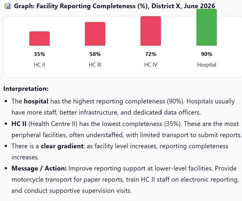
📊 Graph: Facility Reporting Completeness (%), District X, June 2026
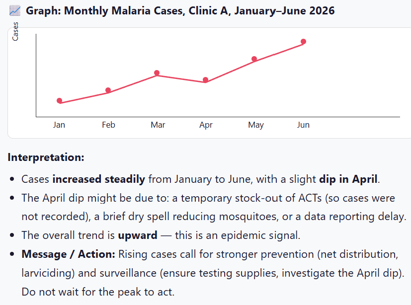
📈 Graph: Monthly Malaria Cases, Clinic A, January–June 2026
Data without interpretation is just numbers. A good epidemiological finding answers three questions in order:
- WHAT? The result. What did you find?
- SO WHAT? The meaning. Why does it matter?
- NOW WHAT? The action. What should be done?
| Question | Answer |
|---|---|
| WHAT? | ORS coverage was 80% (64 of 80 children with diarrhoea received ORS). |
| SO WHAT? | While 80% seems good, 1 in 5 children (16 children) missed ORS. In diarrhoea, missing ORS can lead to dehydration, hospitalisation, or death. This gap is unacceptable. |
| NOW WHAT? | Review ORS stock levels (was there a stock-out?). Assess counselling quality (do nurses explain ORS importance?). Check triage (were mild cases overlooked while severe cases were prioritised?). Re-train staff on IMCI diarrhoea management. |
| Question | Answer |
|---|---|
| WHAT? | Malaria cases rose from 35 in January to 90 in June a 157% increase. There was a slight dip in April. |
| SO WHAT? | This upward trend suggests an outbreak or seasonal epidemic. If unchecked, July and August (peak rainy season) could see 150+ cases. The April dip is suspicious was it a true reduction or a data/reporting problem? |
| NOW WHAT? | 1. Verify data quality for April. 2. Ensure adequate RDTs and ACTs stock. 3. Distribute nets in high-risk areas. 4. Conduct larval source management. 5. Alert the District Health Office. 6. Monitor weekly (not monthly) during the peak. |
📝 Exam Tip: In any data interpretation question, structure your answer using What, So What, Now What. This shows you understand not just the numbers, but their meaning and implications for action.
📋 Task: Use the diarrhoea village dataset.
- Calculate one summary statistic (mean, median, proportion, rate).
- Draw one table or graph to present your finding.
- Write one action-oriented message using What-So What-Now What.
Deliverable in 10 minutes. One presenter per group, maximum 2 minutes. Assessment focus: accuracy, clarity, and interpretation.
- Inspect the distribution before summarising. Look at your data first. Check for outliers, skewness, and errors before calculating mean or median.
- Mean, median, and mode describe the centre. Choose the right one: mean for symmetrical data, median for skewed data or outliers, mode for categories.
- Range, variance, and SD describe spread. A small SD means the mean is reliable. A large SD means the data is scattered use median and range.
- Ratios, proportions, and rates depend on denominator choice. The denominator must include everyone who could have experienced the event. Wrong denominator = wrong conclusion.
- A good finding explains What, So What, and Now What. Numbers alone do not save lives. Interpretation and action do.
- World Health Organization (WHO). (2020). Basic Epidemiology. Geneva: WHO Press.
- Gordis, L. (2013). Epidemiology (5th ed.). Philadelphia, PA: Elsevier Saunders.
- Grove, S. K., & Cipher, D. J. (2016). Statistics for Nursing Research: A Workbook for Evidence-Based Practice (3rd ed.). St. Louis, MO: Elsevier.
- Polit, D. F., & Beck, C. T. (2017). Nursing Research: Generating and Assessing Evidence for Nursing Practice (10th ed.). Wolters Kluwer.